


I work a lot in conversion optimization. I often apply these skills to charity web design projects. In particular, I work a lot on improving the conversion rate of charity donation pages.
I find these pages very interesting. They show many of the challenges that psychology presents to web designers.
So, in this post, I want to look at just a few of the traits that people demonstrate on websites. I will use examples from charity donation pages to show how you can deal with them. But just to be clear, the following advice isn’t specific to donation pages. It will help you with landing pages, lead generation pages, and even product pages.
So let’s dive in by looking at the problem of loss aversion.
Good Charity Web Design Tackles Loss Aversion
The biggest challenge you face when asking people to donate to a cause is loss aversion. Loss aversion is a well-documented psychological phenomenon. In it people feel the pain of losing something more acutely than the pleasure of gaining something of equal value. This combines with the endowment effect, which makes people value things they already own more highly than things they don’t. This creates a problem. When the moment comes to donate to a charity, people feel a strong emotional resistance to giving away their money. This happens even if they intellectually support the cause.
The same phenomena even occurs if they are getting a product in return. The loss of giving up money is more intense than the feeling they get from receiving the product.
Luckily, we can use other traits to counter loss aversion in charity web design. For example, people tend to attribute the value of something to its context. Put another way, value is subjective and can be influenced.
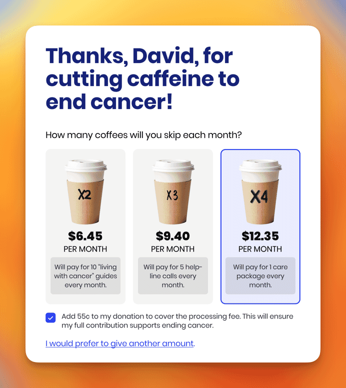
Charities can demonstrate the impact of a donation in order to shape the user’s perception of value. At the same time, they can use anchoring to present the donation amounts in a way that makes the cost feel trivial in comparison to the impact.
In the example below, notice how I emphasized the benefit of the donation, while downplaying the cost by relating it to a cup of coffee.
Of course, loss aversion isn’t the only thing that prevents people from acting. Users will also have concerns and objections that a well-designed donation page will need to tackle.
A Well Designed Donation Page Tackles Objections
People tend to rationalize their aversion to donating in all kinds of ways that are expressed as an objection. These might include:
- Concerns over how their donation will be spent.
- Worries about the security and privacy of the data they enter.
- Doubts about the trustworthiness of the charity.
- Questions about cancelling a recurring donation.
A good charity donation page tackles these objections head-on. It gives clear and open information about how donations are used. It addresses security and privacy measures, charity credentials, and donation management.
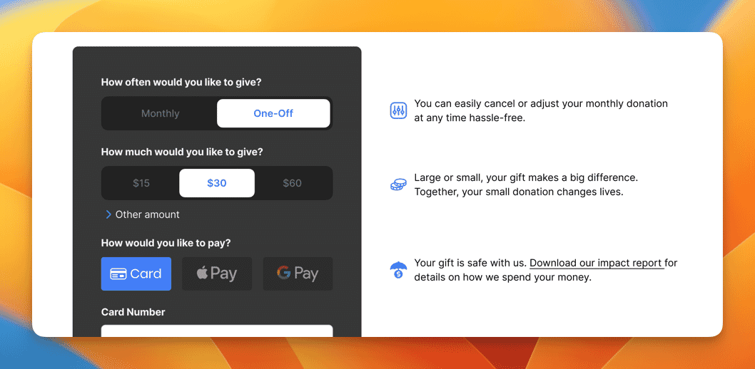
This approach of addressing objections applies to any type of page where you are encouraging users to act. It doesn’t just apply to charity web design.
We can also use social proof to reassure people. It shows that the donation is worthwhile and that others have already contributed. It further overcomes objections and hesitations.
Charities Use Social Proof to Build Trust
Choosing a cause to support, a product to buy or a company to work with takes a lot of thought. Often we prefer to rely on the judgement of others who have already made that decision. We assume that they have considered their actions and so can follow their lead. This is why social proof works.
Charities use social proof all the time. They showcase the number of supporters, as well as show donor testimonials, and endorsements from influential figures. This reassures potential donors and builds trust.
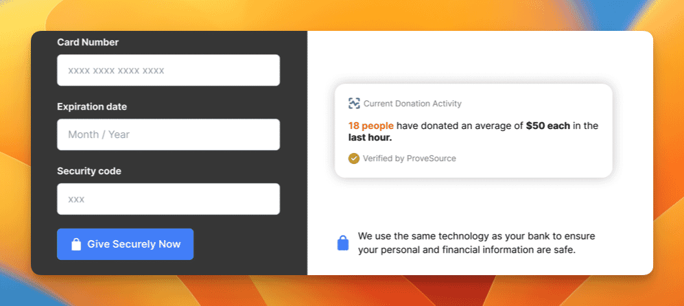
Note in the example below how I highlight how many people have donated recently. I do so at that critical moment users are entering their credit card details.
You can further leverage social proof to build trust by using our bias towards authority figures. Showing that the charity has been accredited or endorsed by an official body goes a long way in reassuring users.
But, also pay attention to the heading in that screenshot above.
Charity Web Design Leverages Commitment Bias
The commitment bias is our desire to appear consistent with our stated beliefs or prior actions especially when observed by others. By adding that heading that thanks them for agreeing to support the charity and by naming them, I trigger this bias.
The average donation page only has a conversion rate of 16%. That means 84% of visitors have clicked on a donate button and then changed their mind. Ecommerce baskets suffer from a similar problem as do most landing pages.
You can use commitment bias by acknowledging the user’s decision to support the charity. This can help fix the high abandonment rate and get them to follow through on their intent.
The Tip of the Iceberg
I’ve only covered a few things today. They’re just the start of the psychological principles that can be applied to any website to nudge people into action. From our bias towards stories, to our tendency to use the default option, there are hundreds of quirks of human behavior that influence our approach.
Of course, as I said in my book Click, you have to use these techniques with care. It’s easy to end up manipulating and ultimately alienating users. However, in the field of charity web design, we’ve more latitude in the use of these techniques.
Most people want to give more to charity. But, our mental biases often stop us from acting on those good intentions. As web designers, we can use that same psychology to balance the scales and allow people to take the action their rational mind desires.
So next time you work on a page that’s encouraging people to act, think about the psychology at play and consider ways to design around it.


