


This post is a part of a podcast course on truly lean UX. Listen to the whole episode above or find out more about the course.
Also in this lesson, Marcus interviews Emma Manning, Senior Project Manager at Headscape.
Finally, Paul chat’s with Billy from Balsamiq about Visual Hierarchy.
We all know how important it is to test our websites with users, and yet it often doesn’t happen as much as we would like. Tight timelines and under-investment make it feel impossible. However, a little testing with users is better than none at all, so in this lesson, I want to explore just how lean we can make our UX testing and still make it worthwhile.
I want to look at four distinct opportunities to introduce testing into our process. You might not be able to test at all four stages, but hopefully, you will be able to do at least some testing in one or more of those opportunities.
Let us start at the beginning, by looking at testing wireframes you produce with clients.
Testing Low Fidelity Wireframes
In my lesson on wireframes, I suggested that they are excellent tools for collaborating with clients and stakeholders and a superb way to kick off a project.
Although these are often nothing more than pen and paper sketches or greyscale wireframes produced in something like Balsamiq, they are a great starting point for exploring things like visual hierarchy, information architecture and content flow.
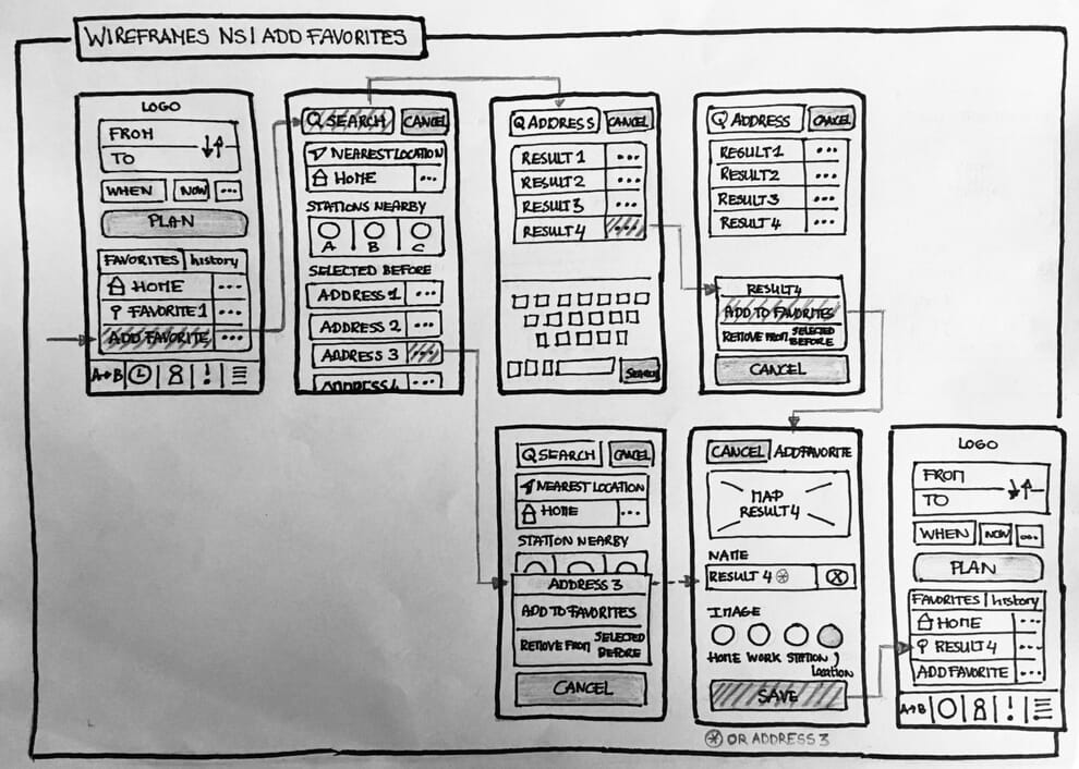
Of course, to be confident in the direction you define in your wireframes, you really need to test them by putting them in front of real users. To do this, there are three tests I favour, the first of which is a card sorting exercise.
Card Sorting
It is a dangerous business creating an information architecture without involving users as the more knowledgable one is in a subject, the more your mental model varies from the majority of users. In other words, how you and your stakeholders organise information will be different from your audience.
See also — How to Do a Card Sorting Exercise and Why Bother
The solution to this problem is to run a card sorting exercise. There are two types of card sorting; open and closed. As in this lesson, I am focusing on testing; we shall focus on closed card sorting, which is ideal for testing the top-level navigation that you have included in your wireframes.
In closed card sorting, you give the user a collection of cards. Each card represents a page on the site and contains some basic information about the page like what it is called and what it covers. Users are then encouraged to sort these cards into the same top-level sections shown on your wireframes. If they can easily do this, you can be confident that the navigational sections you have chosen work.

That said, if time is tight, you could skip to the first-click test, which can also be used to validate navigation.
First Click Test
In the first-click test, I ask users where they would click on a wireframe to complete any critical tasks I am concerned about. This test is worthwhile because research carried out by Bob Bailey and Cari Wolfson discovered that if users get their first click right they had an 87% chance of completing the action correctly, as opposed to just 46% if the first click was wrong.
The final test I run is the five-second test.
Five Second Test
As the name implies, a five-second test involves showing the design to users for five seconds, before taking it away. You then ask them to recall what they saw and make a note of the order.
I find it an invaluable way of giving myself and the client confidence that I have got the visual hierarchy and content flow of pages right. If users easily remember critical content and calls to action, I know things are looking good.
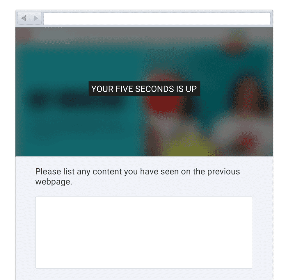
What is particularly good about the five-second and first-click tests is that they are also ideal when you move onto the design mockup.
Testing a Design Mockup
In my previous lesson on pain-free design approval, I talked about how testing a design mockup with users is an excellent way of avoiding revision hell because it discourages the client relying on their opinions or designing by committee.
That means in many ways testing at the design mockup phase provides the best return on investment, especially if you are an external freelancer or agency.
As I mentioned in my previous lesson, there are three tests I like to carry out when working on a design mockup. These include the five-second and first-click tests we have already discussed. However, the third test I like to run on a design mockup is the semantic survey. That is probably my favourite for testing design mockups.
Semantic Survey
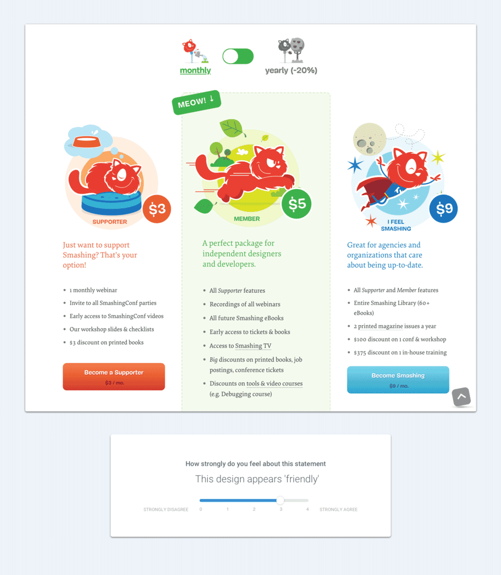
The next time a client complains about the visual aesthetic of a design consider running a semantic survey. As I explained in the previous lesson, this involves showing the design to a handful of users and asking them how strongly or otherwise they associated it with whatever keywords you want to communicate.
For example, if your aim is for a design concept to feel friendly, you would ask “how strongly do you agree with the statement that this design is friendly?” They can then rate their agreement on a scale of 1-5. This one simple test will end debates about whether the design will ‘wow’ users or not.
Obviously, in an ideal world, you would test throughout your website redesign. However, if you are forced to only test once, I would recommend that you test your design concepts.
The reason I favour testing a design mockup or possibly wireframe is threefold.
- First, all three tests we have covered so far can easily be carried out with a tool like Usability Hub who can even recruit users for as little as a dollar per participant.
- Second, stakeholders typically have the strongest opinions about design, and so it can avoid endless debate and ensure the focus remains on the user.
- Finally, the earlier you find problems with a redesign, the easier it is to fix them. Always test as early as you can.
In short, I believe that testing a design mockup gives you the most return on your investment and will help encourage stakeholders to consider more testing later in the process.
However, if you are in a position to produce high fidelity prototypes, this provides another excellent opportunity for testing.
Testing High Fidelity Prototypes
On larger more complex projects it makes sense to build a high-fidelity prototype, often known as an alpha. That includes the fidelity of a design mockup but is interactive, allowing the user to navigate around the site.
The interactive nature of prototypes opens up opportunities for testing that are not available with design mockups, especially around information architecture and usability. This testing almost always involves some form of usability testing.
Usability testing comes in four flavours:
- In-person facilitated.
- Remote facilitated.
- In-person unfacilitated.
- Remote unfacilitated.
I have all but given up in-person testing these days. Even before the pandemic, getting people in a room for testing was challenging and with tools like zoom, largely redundant.
At the prototype stage, I also favour facilitated testing over unfacilitated. That is because we are still very much in the process of defining the direction of the site. I am therefore keen to ask questions of participants and gain their insights, something you cannot do with unfacilitated testing.
I am conscious that facilitated usability testing is more work, however, it is not as hard as you might think.
How to Keep Usability Testing Simple
One of the biggest reasons usability testing doesn’t happen is that we struggle to find the right people to test. There can be all kinds of reasons why it is hard to source real users, and even when we can, arranging time with them feels like it delays the project.
But if you are testing things like findability, information architecture and visual hierarchy, getting the right demographic isn’t as important as you think. Unless your audience is elderly, very young or has a disability of some kind, most people will struggle with similar problems.
Instead of fretting about demographics, grab anybody who isn’t involved in the product, service or company. Family members are perfectly fine, as are non-work friends.
Yes, you will get better results if you get the right audience, but if sourcing people is going to stop you, then don’t worry too much about it.
Also, don’t worry too much about numbers. You don’t need to test large numbers of people. Yes, using more people is better. But after about 5-6 people the number of new issues found decreases dramatically. Numbers do matter if testing aesthetics, but they matter a lot less when testing usability. Even a handful of people will spot most of the issues.

Hopefully, you can see that usability testing can be done in a ‘lean’ and lightweight way. But before we move on, let me share a few tips to ensure it goes as smoothly as possible.
Tips for Getting Started in Usability Testing
Running your first usability session can feel a little scary, but it shouldn’t do. The users who you are testing with don’t know if you are doing it wrong, and anyway, there is no single way to run these sessions.
That said, some things will help you get more value from usability testing. Here are a few tips to bear in mind.
Do some preparation
If you are new to running usability testing, spending some time preparing will make all the difference. It will give you confidence and that, in turn, will relax participants.
Work out exactly what tasks you want the user to complete and any additional questions you want to ask. It is also worth writing a script for the first part of the session so that you cover all of the basics that a participant needs to know.
See also: What Goes Into a Usability Test Script?
Keep sessions short
Participants find usability test sessions tiring, so keep the sessions as short as possible. Remember people are helping you out, so you don’t want to abuse their generosity even if you are compensating them for their time.
I usually aim for a maximum of 40 minutes per session. That works well because you can schedule one meeting per hour and it gives you 20 minutes between sittings to update your notes and reflect on what you have just seen.
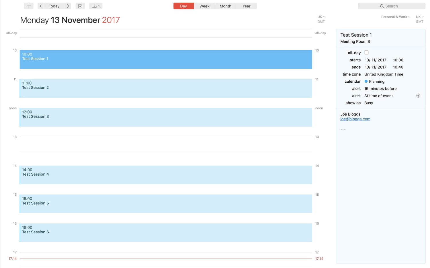
In that time, you can’t expect users to complete any more than about three reasonably complex tasks (like purchasing a product). Realistically you will have about ten minutes per task once you have welcomed the participant and explained how things work.
Make the participants comfortable
It is critical to ensure the participant is relaxed. If they are not, they will behave unnaturally and fail to talk freely about what they are thinking (a vital aspect of a good usability session).
Make it clear that they are not the ones you are testing. That is why you should avoid referring to it as user testing! Explain that there are no wrong or right answers, but instead, you are looking for shortcomings in the service.
Next, distance yourself from the project. If you have helped build the service, I recommend playing that down. I have even been known to lie and say I wasn’t involved at all. The reason I do this is to give participants the freedom to criticise it. If they think you created it, they won’t want to upset you by pulling it apart, especially if you are paying them for their time.
Finally, keep the entire session casual and friendly. Offer people tea or coffee. Start the meeting with some small talk and ask the user a little bit about themselves. Do everything you can to put them at their ease, which includes limiting the number of people in the room. If others want to watch, make sure they do so through a remote link.
Try not to influences the participants
Be careful in sessions not to accidentally nudge the participant in the right direction. In particular, watch the wording of the tasks you ask people to complete. For example, avoid including words that appear in the interface. People will instantly look for those words and so be more likely to complete the task.
You will find users will ask questions during a task. Resist the urge to answer them unless necessary as you may well accidentally assist them. They wouldn’t have somebody sitting there answering their queries in the real world!
Instead, apologise and explain that you don’t want to influence them. Then at the end of the session, return to the participant’s questions and answer them at this point.
Always record sessions
When you do run test sessions, make sure you record them, capturing both the user and what they are doing. I use a tool called Lookback which captures the user via a laptop’s webcam and records the screen as well. However, you could just as easily use Zoom.
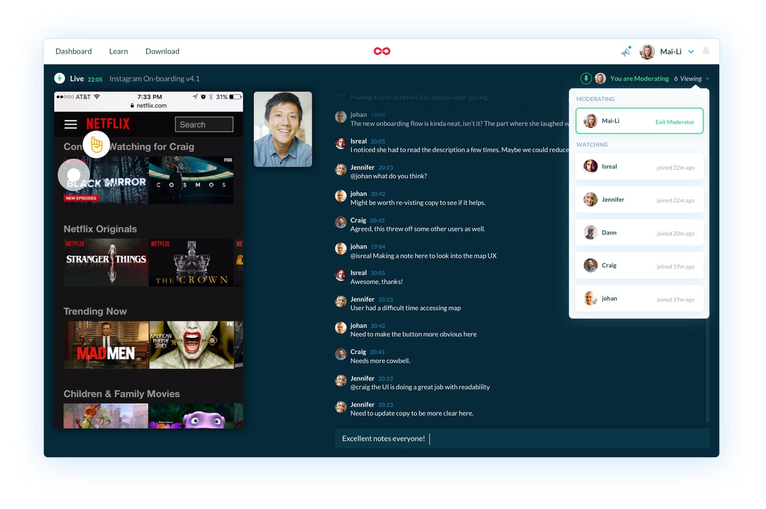
These videos are great for referring back to afterwards, but they have another benefit too. You can take them and edit them down into a compilation of critical moments, which you can show stakeholders and management who are unable to attend. That said, wherever possible, get people to watch the sessions live so you can discuss them together.
If you follow this advice, you will be amazed at just what you discover, and I promise you will want to carry out usability testing more often, including as you move into the development stage.
Testing During Development
Hopefully, with all of the testing you have done, you should be in a strong position when you start the build. Your information architecture, design, content flow and visual hierarchy should all be tailored to your audience, and it will then be a matter of building the site.
That said if time and budgets allow it is worth testing during the development phase too. That is because the more rounds of testing the more issues you will uncover as previous usability barriers are removed.

There is also the fact that usability hurdles will creep in as you make changes during the build process.
You could run additional rounds of facilitated testing during development. However, I am aware this can prove time-consuming, so an alternative is to run some unfacilitated testing.
In unfacilitated testing, you do not watch the usability sessions live. Instead, you set a task and invite users to participate using a tool like Lookback, Maze or UserTesting. They then complete the task while talking through their thinking out loud. Each session is recorded so you can watch it at your leisure later. These tools will even do the recruitment for you if you so wish.
Although unfacilitated testing does not allow you to interact with users, by this stage, you should have caught most of the big issues already. Testing in the development stage is really about a sanity check as it is too expensive to make big changes this late in the process. There will always be opportunities post-launch to test further and optimise the website as we will discuss in the next lesson.
Do What You Can
I am conscious that this course is supposed to be focusing on Lean UX and yet in this lesson, I have given you a whole raft of different testing options, far more than you probably have time to do. However, that doesn’t mean you should do them all.
When it comes to testing with users, it is better to do something, no matter how small, than to do nothing at all. Start small and add more testing over time as clients and stakeholders begin to see the value of it.
We also have a habit of fixating on in-person facilitated usability testing when that is often not the most cost-effective option. As I have already said, testing a design mockup often brings the best return and is relatively easy to do.
At least, it is the best option during the redesign phase. However, once a site goes live, you will find a whole host of new options available to you, but we will cover those in the next lesson.


